2021 — Freelance
Evolve Academy
A space for personal development in life transitions
evolve academy
description
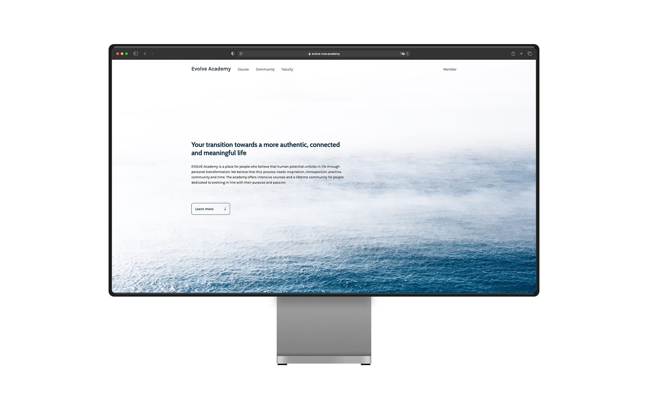
Evolve Academy is a space for personal development in life transitions, offering an 8 week-long course and community membership. Ahead of the launch of their first workshop, I was approached by the founders to create a promotional website that introduces the program and develop its brand identity and visual tone. Before the start of the course, I also developed a members' space for the course content.
After several video editing heavy projects, I decided to create a more fun tool to mix sound-effects than the usual drag, drop, push and pull actions in Premiere. Bruit Brut allows you to create your own sound effect compositions by pressing your keyboard keys. You can also create your own fully customised board, changing sounds and key bindings in the downloadable code.
visual
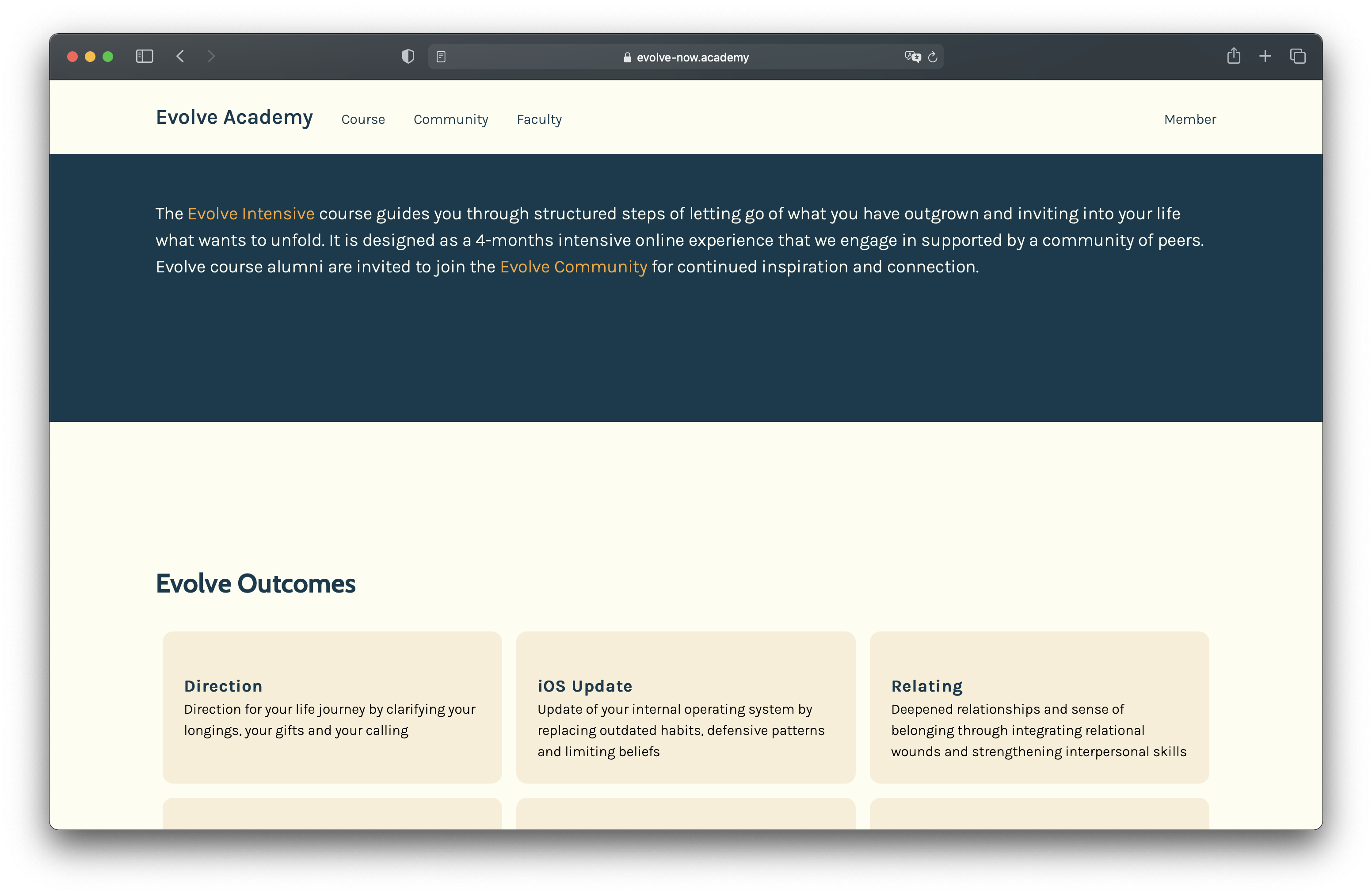
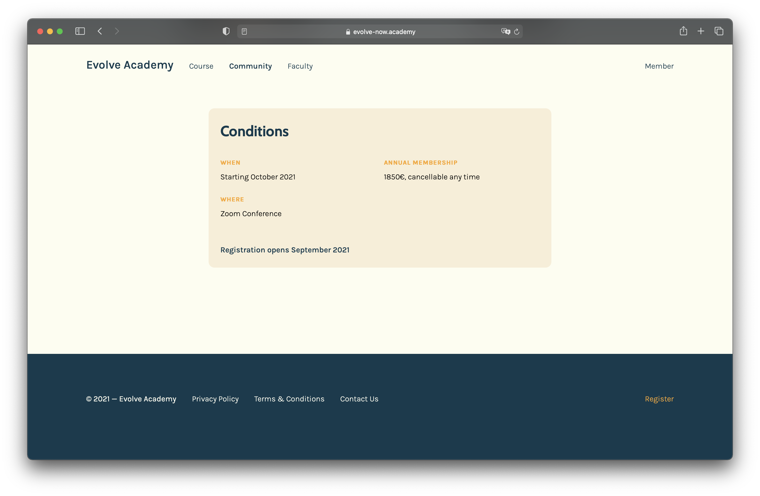
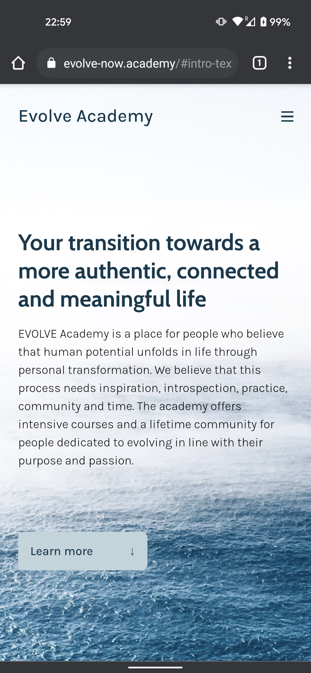
Considering the target audience and purpose of Evolve, we wanted the visual language to communicate calmness, openness and positivity. With nature, and especially the ocean, having a prominent, grounding role in the path to personal development, the choice of colors and imagery was inspired by warm, coastal environments. Similarly, the typography was chosen to be undistracting with a lot of white space, without seeming to artificial and geometric.
experience
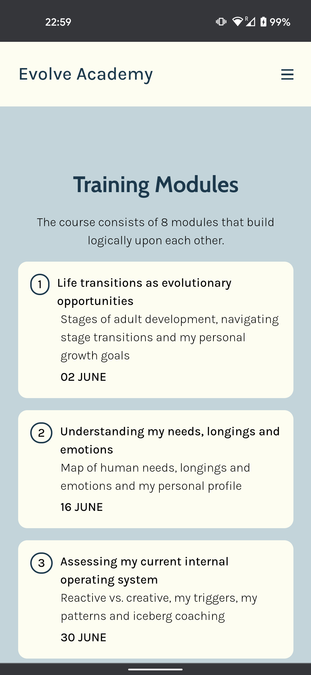
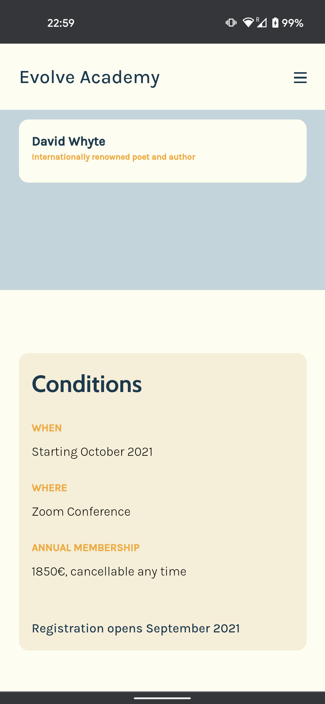
Knowing most people would get the link to the website on social media or text messages on their phones, a great mobile-first and easy-to-read experience was crucial for attracting potential participants. Avoiding long texts, many of the key points are underlined in simple graphics. Each of the two programs also features a quick summary with the most relevant information. I also made sure to include a CTA to register for the upcoming course at the end of every page.
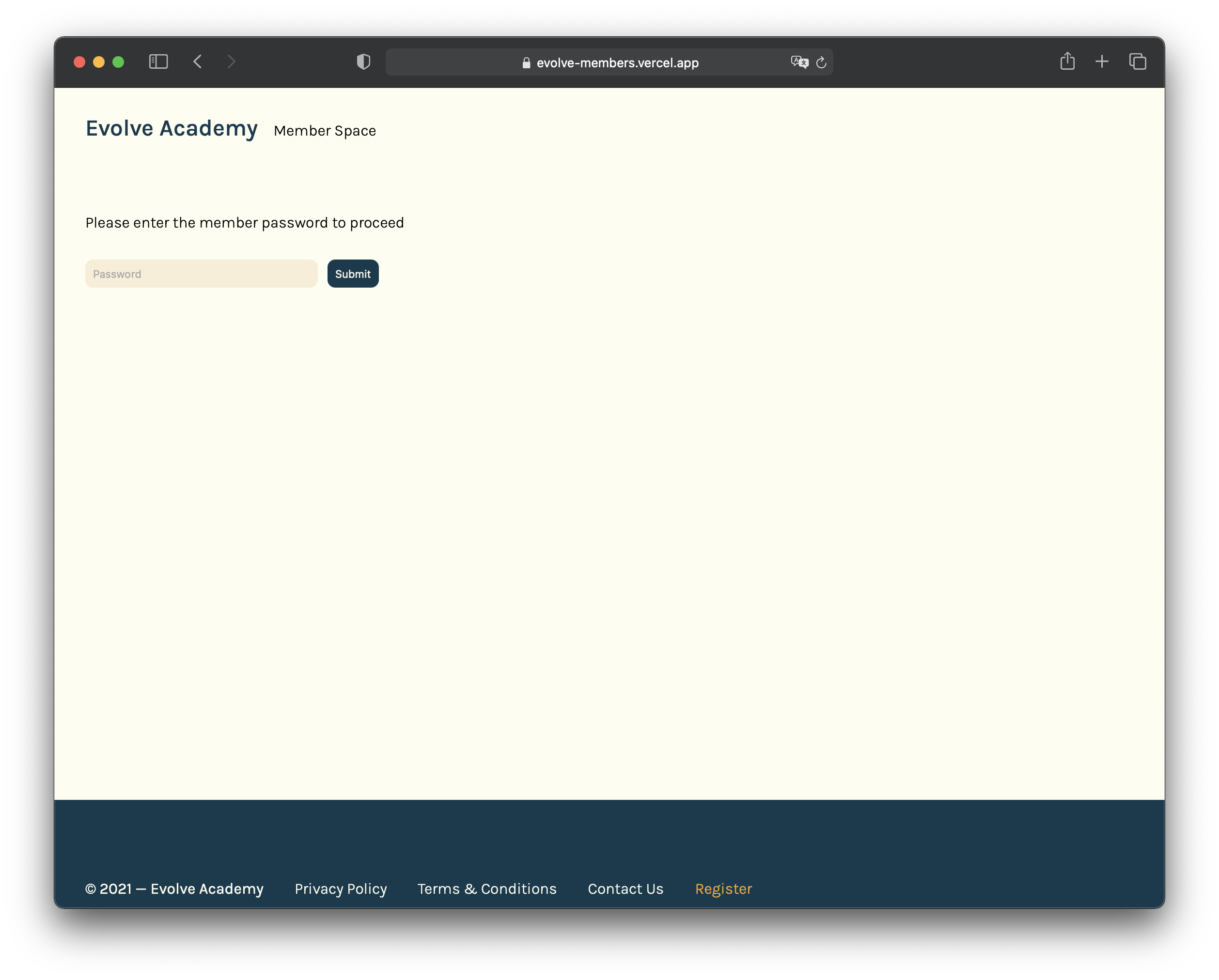
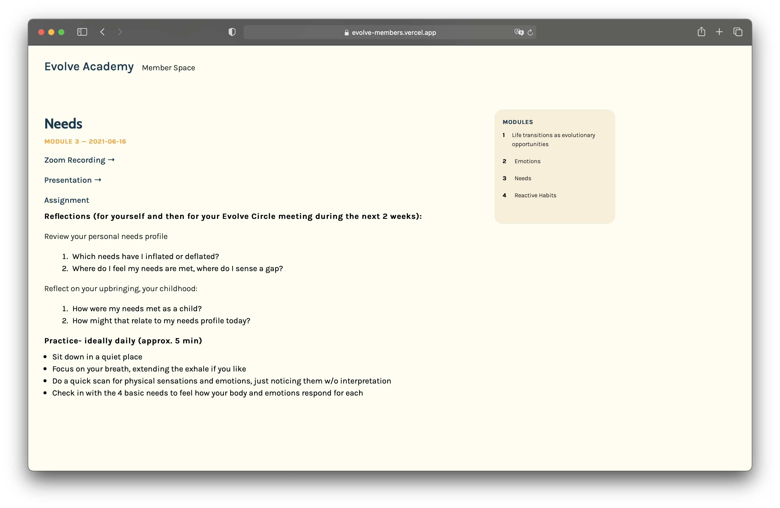
member space
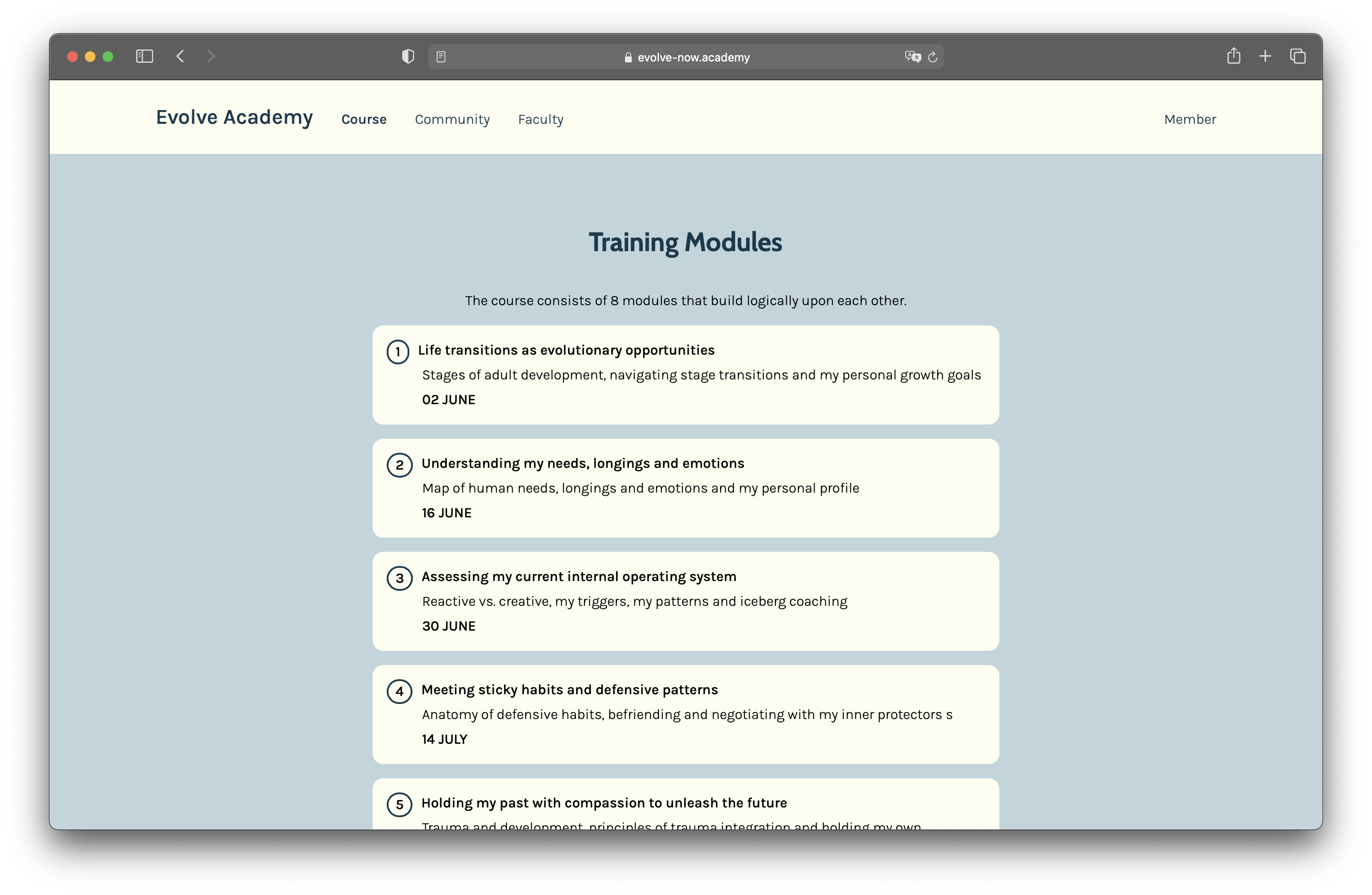
The member space is used to post weekly updates with zoom recordings and assignments for the participants. Considering the fairly small amount of content per week, I decided to go with a simple scroll-down page, so users would see the relevant, most recent post right on top of the front page. To avoid trouble with finding older modules, I also included a table of content with anchor links to navigate all modules.
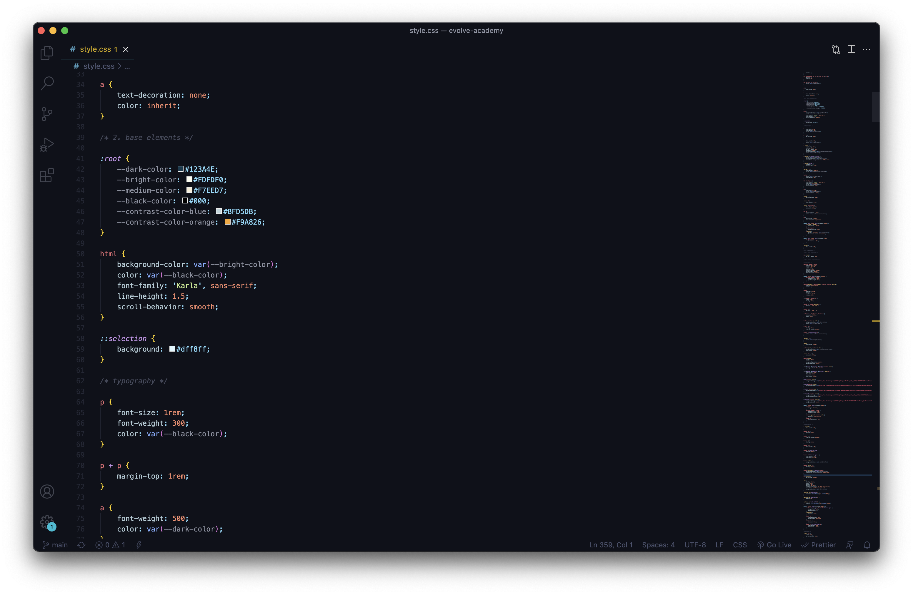
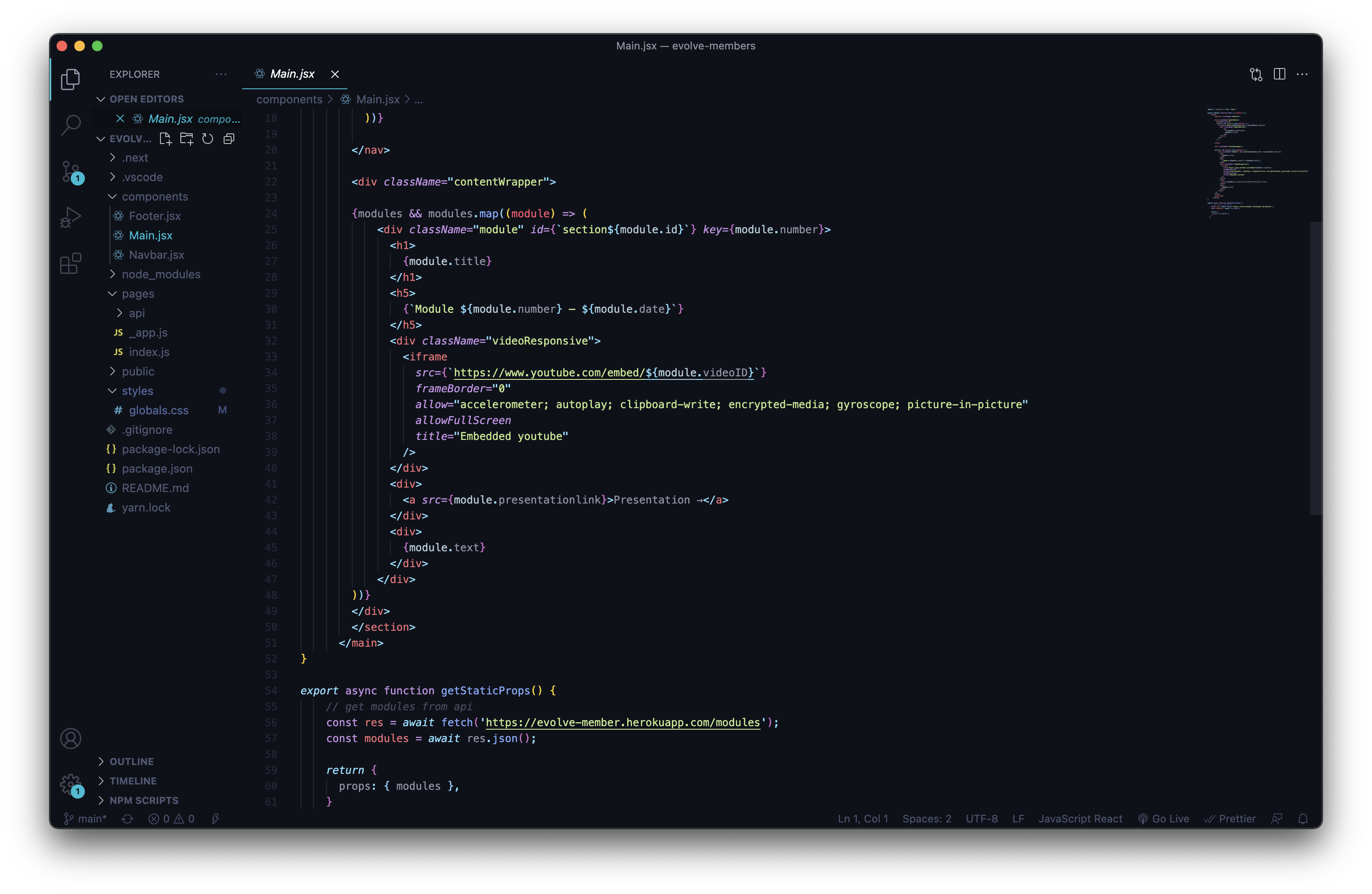
technical
While not being updated too frequently, the organizers of the course still needed to be able to upload the new module content and change some parts of the website. I therefore chose to develop the frontend with Next.js for static-site generation and a headless content management system, Strapi, to make an API. Hosted on Vercel, Heroku and Cloudinary for media, I managed to keep the running costs of the website to zero.
role
Web Design
Web Development
Art Direction
Branding
credits
Photographs from Unsplash
Interested in collaborating?
© Jonathan Riese 2021
© Jonathan Riese 2021