2019 — School Project
Circular
A platform to exchange and give away things for free, reducing waste and helping save resources.
app idea
We all have things that we bought but never actually used or have not used in a long time. They might be too valuable to throw away, but also not worth the effort of selling them. That is where Cicular comes in: it allows you to easily pick up and give away things for free.
After several video editing heavy projects, I decided to create a more fun tool to mix sound-effects than the usual drag, drop, push and pull actions in Premiere. Bruit Brut allows you to create your own sound effect compositions by pressing your keyboard keys. You can also create your own fully customised board, changing sounds and key bindings in the downloadable code.
User Research
User Research
validated personas
validated personas
I interviewed a range of people regarding their experience with keeping, getting rid of and selling used / unnecessary items to develop 3 different personas to consider during the design process.
John, 27
Biography
As a young working professional, Chris has to frequently relocate and change apartments for new jobs.
Needs
A quick, easy and inexpensive way to get rid of and aquire new things when moving.
Goals
Saving time and money and being efficient to have more financial security and focus on his job in a competive market.
Frustrations
Selling things online takes a lot of time and effort, his room currently looks like a storage unit.
Anne (37)
Biography
Just moved into first own apartment with her partner, gets paid well and is ready to make that place her home.
Needs
To get rid of a lot of things and free up space, so she can replace them with new stuff.
Goals
Make a new home, while feeling good about where her old things go. Does not want to throw them away but does not have time to sell them.
Frustrations
Selling things online is too complicated, but wants to give her things to people that need them and be sustainable.
Lisa, 20
Biography
Had to take a student loan to pay for education, can barely afford the extremely high cost of living.
Needs
School supplies, household items or just anything for a cheap price to be able to afford living in the city.
Goals
Saving money, being able to afford a normal live and school supplies.
Frustrations
Buying used things online can be a financial risk and at times scary or dangerous, but can not afford to buy new.
main features
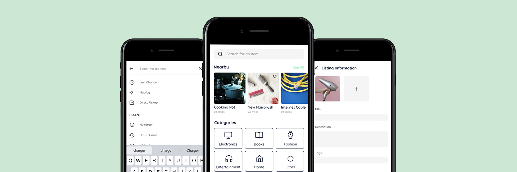
Looking at the research outcomes and considering the journey of an item through the product, I identified three main steps and features: first, a user would list an item. Then, another user would search for the product and find it, leading to the item being handed over from one to the other.
Listing an Item
Listing an Item
For this feature, I wanted to include two ways of adding a product. First, the user should be able to see all currently active, previous and drafts of listings and add a new one from there. However, to make the feature more easily accessible, I also decided to include a "quick add" function available from the home screen. I developed two high fidelity designs and prototypes from my wireframes to make an A/B test.
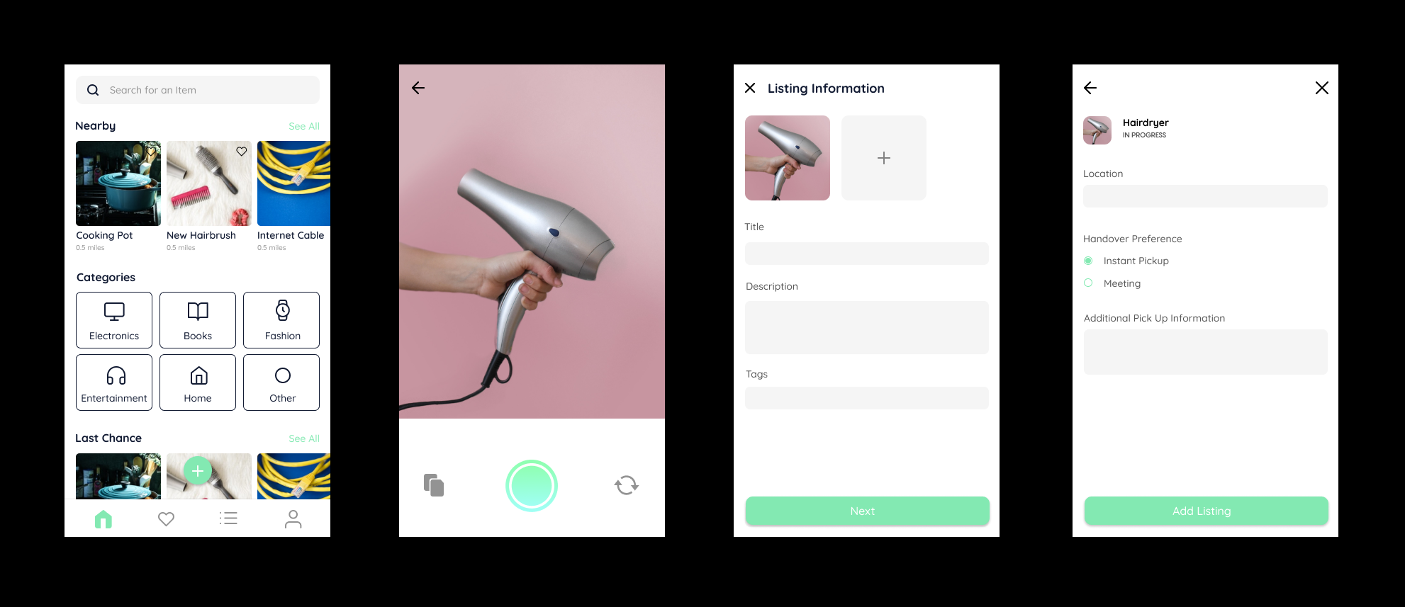
Design A: "Quick Add" Button in Home, Camera First, 2 Steps, Radio Button Selection
Design A: "Quick Add" Button in Home, Camera First, 2 Steps, Radio Button Selection
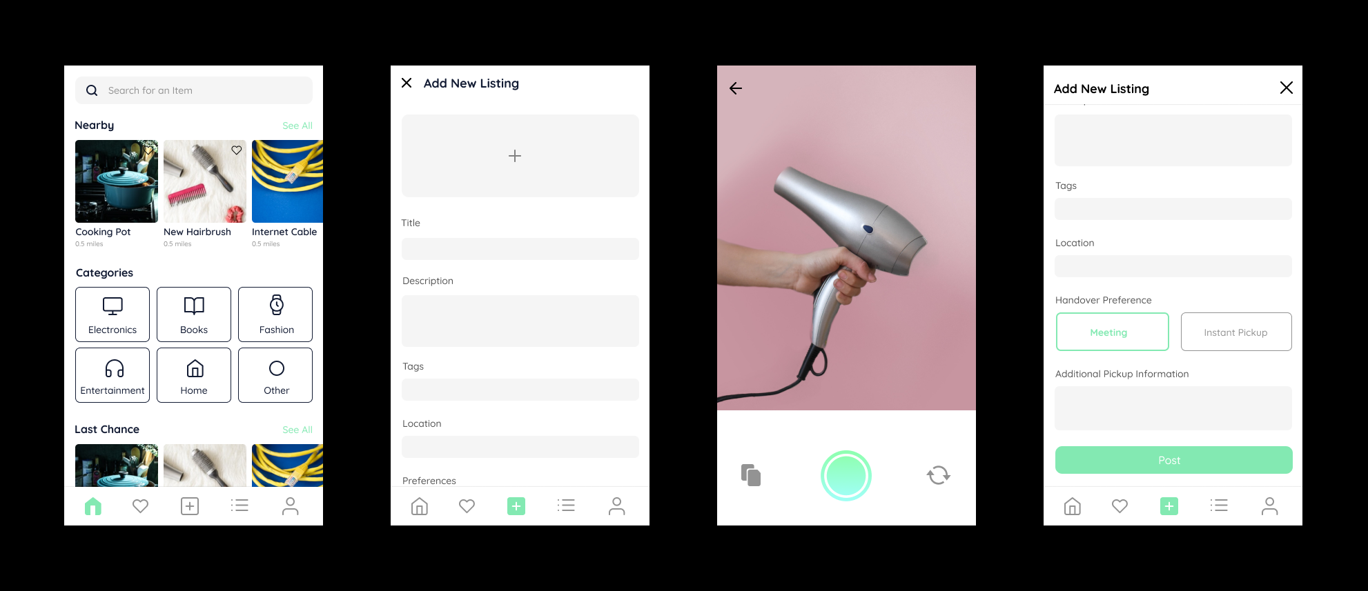
Design B: "Quick Add" as Navigation Item, Camera Second, 1 Step with long Scroll, Box Selection
Design B: "Quick Add" as Navigation Item, Camera Second, 1 Step with long Scroll, Box Selection
user feedback
user feedback
I tested and compared the two versions to decide on the final design of the feature. All preferred having the button outside the navigation bar, making it stand out more, and the camera coming up immediately for quicker use. Most were in favor of a scroll rather than having to click through two steps, but without the navigation bar to free up space, and liked the box selection more than the radio buttons for better visibility.
Users furthermore favored clear categories over tags and liked the idea to include the condition of items and the option to have a timer of when something was going to be thrown away. As the gallery icon in the bottom left of the camera screen was unclear to some, I decided to change it as well.
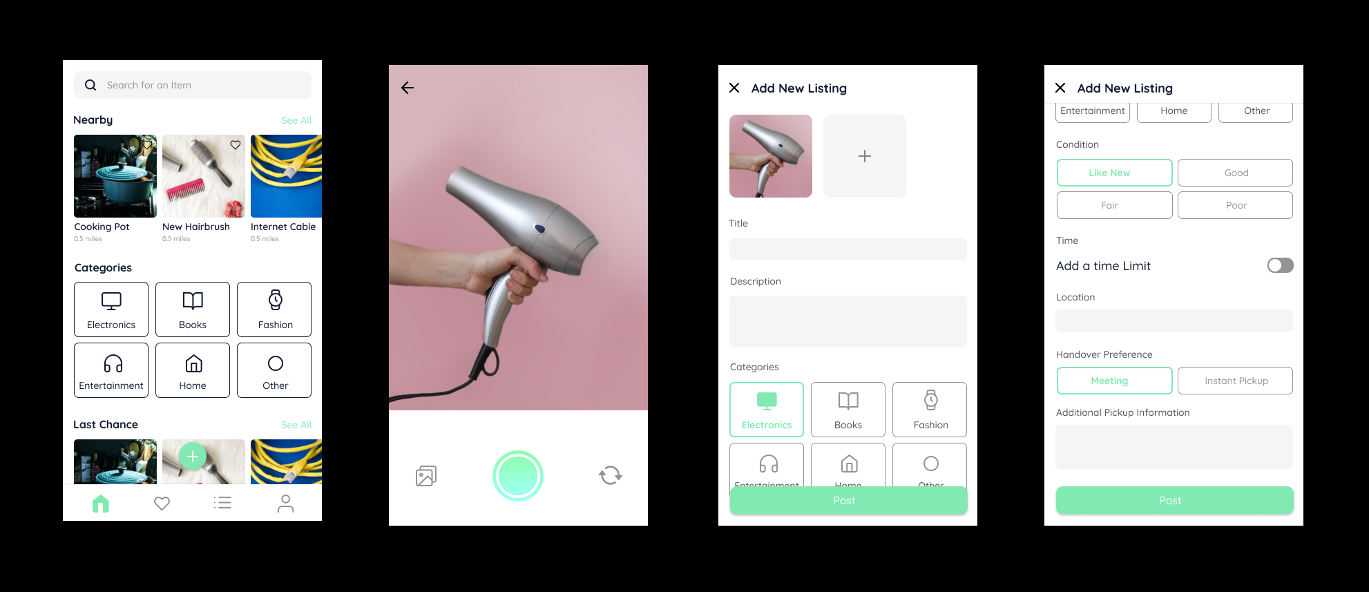
Final Design
Final Design
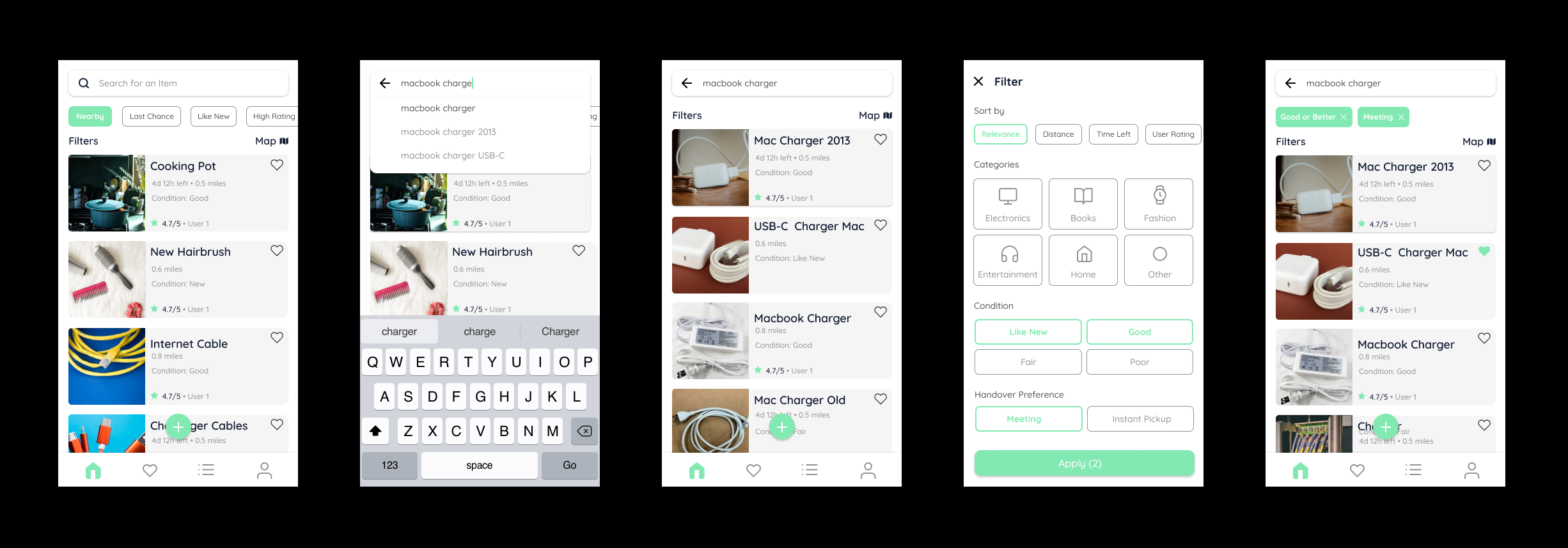
Finding an Item
The key elements for this feature are the search function as well as filters, to help the user find what he/she looks for quickly, easily and precisely. I there therefore focused on creating an intuitive search with smart suggestions, an easy to navigate filter system and a list / map view toggle that gives a good overview of the items available.
user feedback
user feedback
I came across a couple of problems and improvements when testing the design. First of all, some suggested to show a browse / discover page first, as the display of the closest products might be less useful. Then, many found the product list pages a little too busy and the “filter” and “map” links should stand out more. Some were also confused by the horizontal scroll on the ”sort by” filter, which should rather look the same as all other filter options. I also decided to better use the search, making it full screen with more suggestions, showing previous searches and categories.
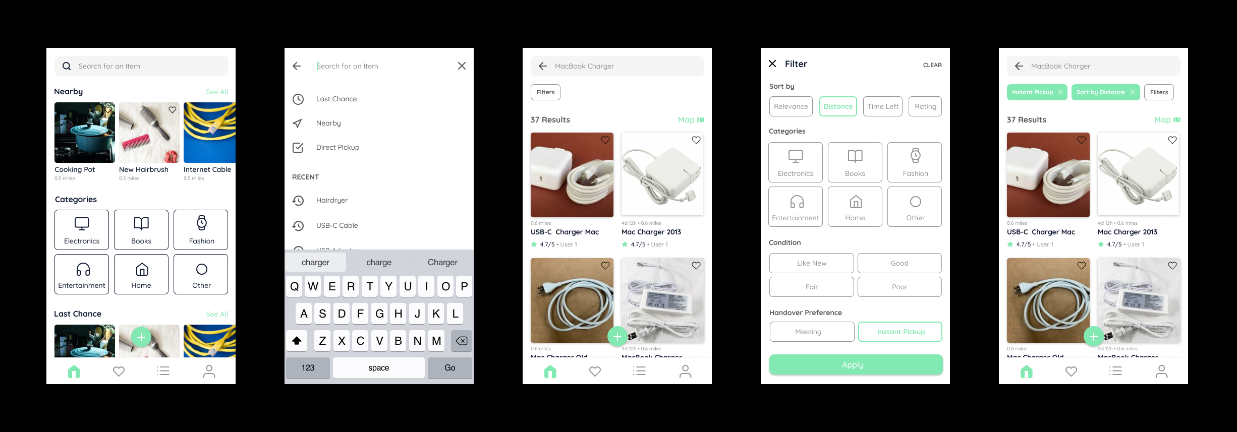
"Finding an Item" Final Flow
"Finding an Item" Final Flow
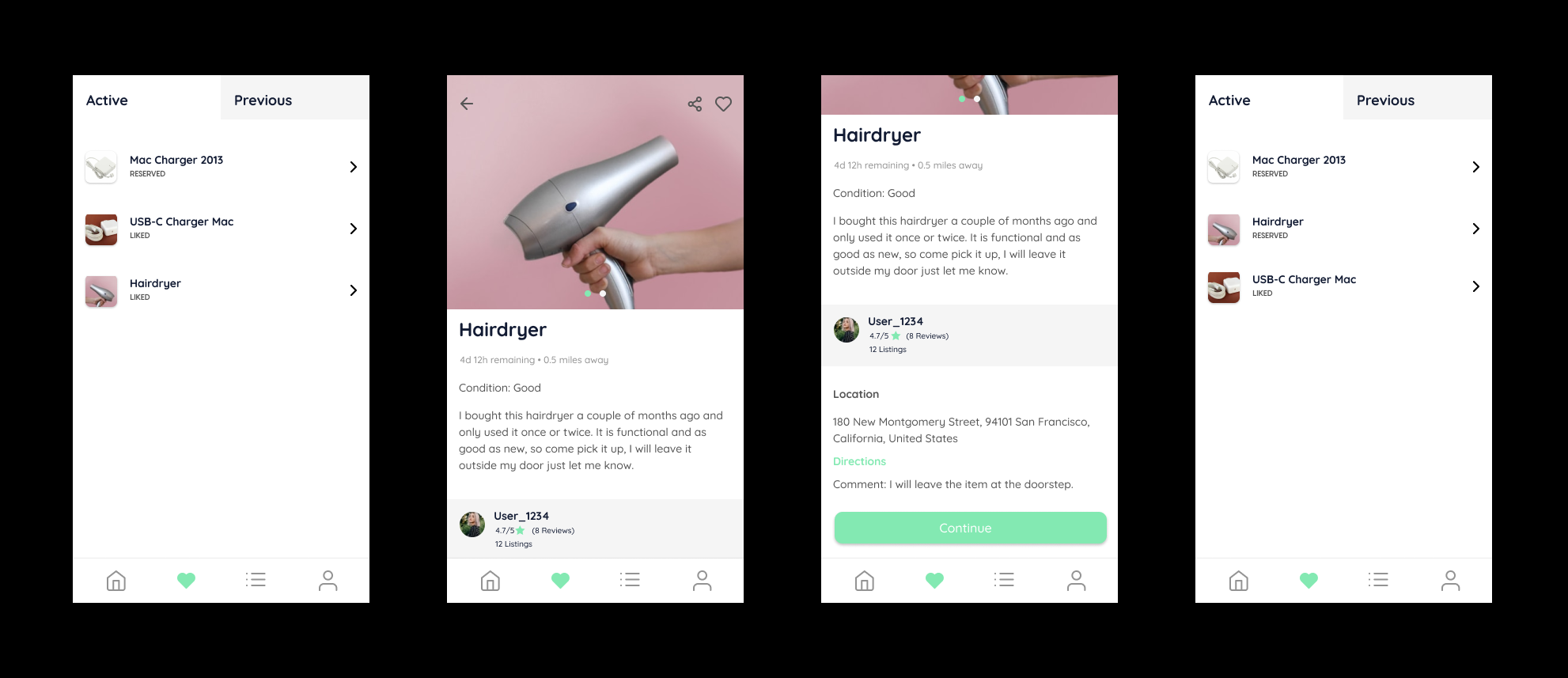
Item Pickup
An item can exchange hands in two different ways: meetings and pickups. Meetings would be the conventional way things are sold online on platforms such as Letgo or Craigslist, you message someone, decide on a time and place and get the item there. However, during my research I found that many users have had bad experiences with messages from strangers and that these meetings can at times be scary. Therefore, I wanted to give people the option to just leave it somewhere for someone else to pick it up; similarly to people leaving furniture on the street only that more people can see it.
user feedback
user feedback
Many users were confused by the wording and tabs system on the first page, so I decided to put the two tabs together and divide the different states of products into different lists and added the option to delete entries from the list easily. I also changed the wording of the button from "continue" to a more telling "reserve" and added an extra step to remind users of the conditions for pickup.
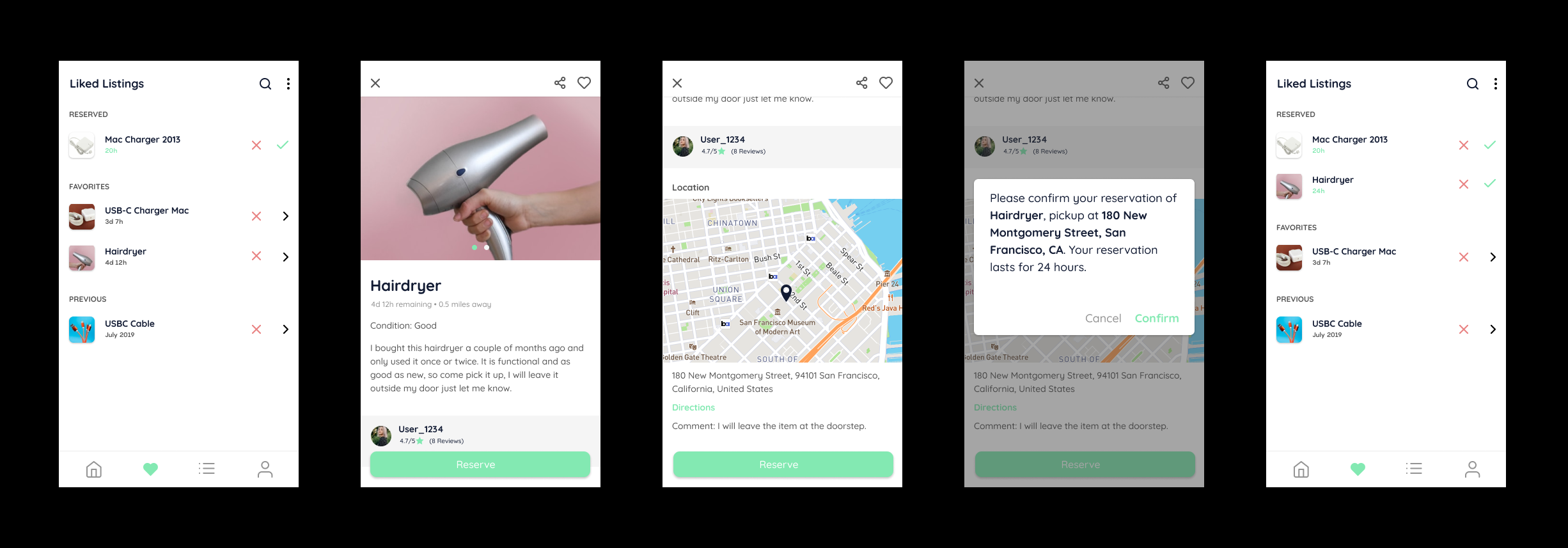
"Item Pickup" Final Flow
"Item Pickup" Final Flow
Prototype
I developed low fidelity Figma prototypes for all user testing, linking all pages and using simple animations, which I let the test group use on my phone. I also made a final protoype to test for final adjustement of the entire app design which can be viewed here.
role
App Idea
Competitive and User Research
UX & UI Design
User Testing
Prototyping
role
Graphic Design
Photography
Copywriting
links
links
Interested in collaborating?
© Jonathan Riese 2021
© Jonathan Riese 2021