2020 — School Project
attend
2020 — School Project
Saving Coral
A cross-platform application and physical device to connect the elderly to the world in times of isolation
concept
Attend is a platform where elderly can ask for help and find people that want to support them. During Corona lockdowns more than ever, there are many elderly people who have trouble or are scared of performing everyday tasks such as grocery shopping. Making up more than 80% of all deaths in the US, they need special protection and minimal exposure to the outside world to lower the chances of infection. All decisions for the design were informed by user research with the target group in mind. To allow easy access to the product, it would be available as a mobile and web app as well a physical device for people without a smartphone.
Prototype of a TV advertisement for the product
User Research
demographic
Elderly are generally defined as people aged 65 or older, and are the fastest-growing demographic across the world. Due to cognitive and physiological changes with age and a lack of comfort with technology, certain design considerations should be made:
Vision loss – larger font sizes needed, shades of blue fade, increase color contrast, large buttons, screen reader accessibility, labels on icons, tablets
Declining motor skills – Clear and easy visual cues and interactions, no complex interactions with multiple fingers, both hands or quick movement
Cognitive declines of memory and concentration – more time to absorb and process information, notifications/reminders, progressive disclosure and minimalist design to prevent cognitive overload
Motivation – practicality very important, over aesthetics or gamification
personas
Emma (72)
Situation – Lives with her husband, far away from relatives that could help. They both have smartphones, tablets and computers and use apps such as Whatsapp or Facetime on an almost daily basis.
Problem – She is scared of going grocery shopping and does not know anyone that could help her close-by who is not in the risk group
Needs – someone to get groceries and medicine for her and her husband
Albert (85)
Situation – Lives alone and isolated because he is very scared of getting sick. He does not have internet or a computer and does not how to use his phone for anything other than calling people.
Problem – He can not go outside to get food or medicine. He sometimes feels too weak to cook for himself, but can not afford to order food delivery from restaurants. Not being able to meet any of his friends right now also feels lonely at times.
Needs – A way to reach people that can get groceries and medicine or prepare a meal for him. People to talk to occasionally.
Website
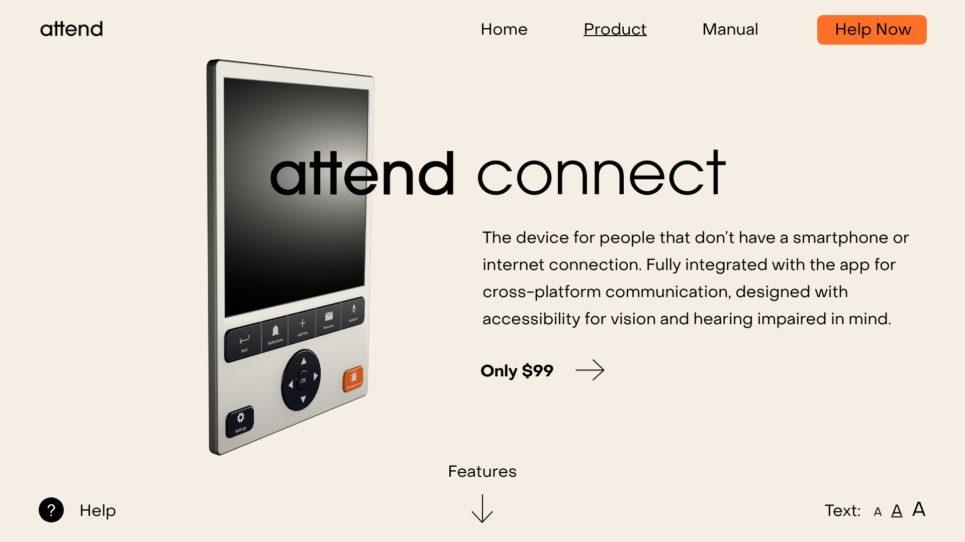
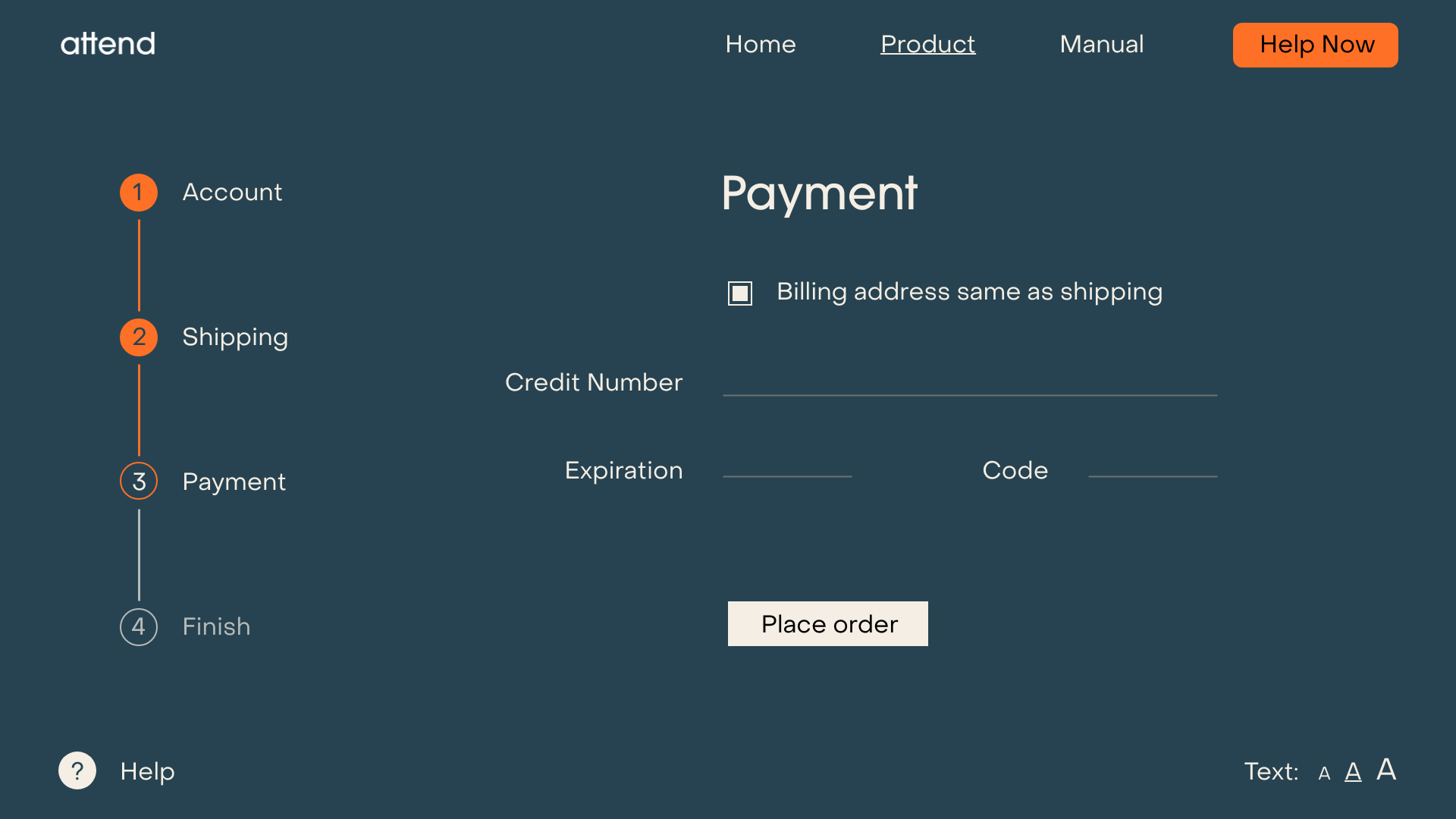
The main purpose of the website is to present physical device, teach and help people use it and allow customers to order it. For easy accessibility, the main priority was clear and large typography with the option to set a font size. The website also has a help chat that supports users in finding what they want.
Mobile App
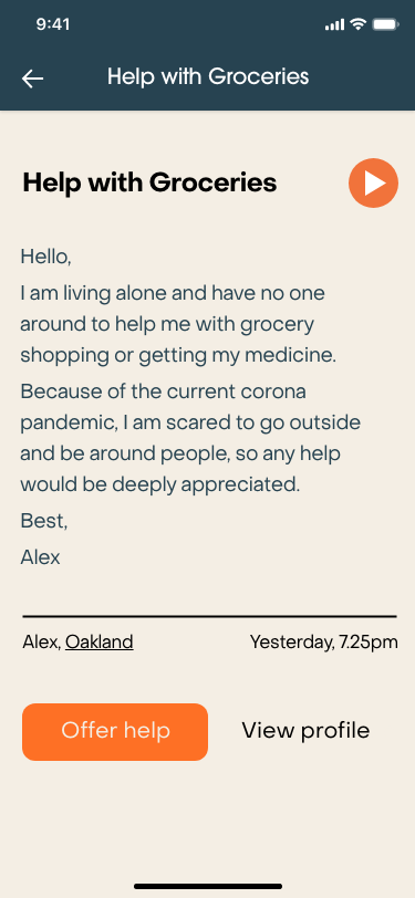
The main function of the mobile app is for people to see and answer requests for help. The front page is therefore a feed of posts asking for help, which can be filtered and viewed on a map to discover people in need nearby. As users on the other end might be using the audio assistant for visually-impaired, some post and messages will be in audio form and automatically transcribed.
The main function of the mobile app is for people to see and answer requests for help. The front page is therefore a feed of posts asking for help, which can be filtered and viewed on a map to discover people in need nearby. As users on the other end might be using the audio assistant for visually-impaired, some post and messages will be in audio form and automatically transcribed.
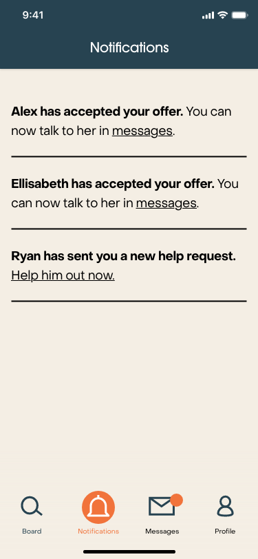
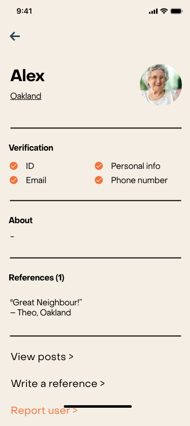
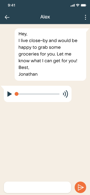
To address potential safety concerns when giving away personal information and interacting with strangers online, I built multiple layers of security into the design. First of all, personal messages can only be sent once a help offer has been accepted, avoiding spam and other malicious messages. Individual profiles also show several verification options, with some of them required to be able to use the app functions.
To address potential safety concerns when giving away personal information and interacting with strangers online, I built multiple layers of security into the design. First of all, personal messages can only be sent once a help offer has been accepted, avoiding spam and other malicious messages. Individual profiles also show several verification options, with some of them required to be able to use the app functions.
To address potential safety concerns when giving away personal information and interacting with strangers online, I built multiple layers of security into the design. First of all, personal messages can only be sent once a help offer has been accepted, avoiding spam and other malicious messages. Individual profiles also show several verification options, with some of them required to be able to use the app functions.
Physical Device
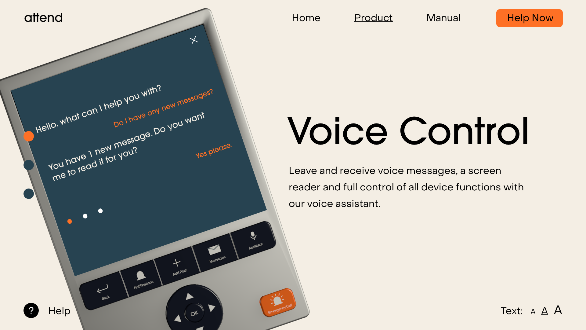
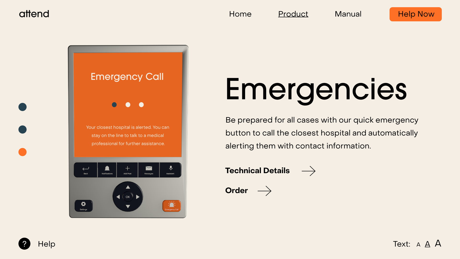
The purpose of the device is to connect elderly with little technical knowledge to app users. It is therefore very important that all functionality has to be accessible for vision, hearing and movement impaired users. To cater to this, the device can be used with a touchscreen, physical buttons as well as a voice assistant. The large buttons have clear iconography with labels and an arrow navigation well known from TV remotes, also including a brightly colored emergency button that will automatically alert the closest hospital with the users information.
advertisement
As my target audience, elderly in isolation, would use TVs as their main media to get information from the outside world, I decided to advertise for the device on TV. From there, interested viewers could call a phone number to order their device, so the whole process does not require a device with internet access.
custom icon design for the device
role
UI/UX Design
User Research
Product Design
Web Design
Visual Identity
Interested in collaborating?
© Jonathan Riese 2021
© Jonathan Riese 2021